
Visual Identity
Creative Pulp
Creative Pulp
Project in progress. See below for updates.
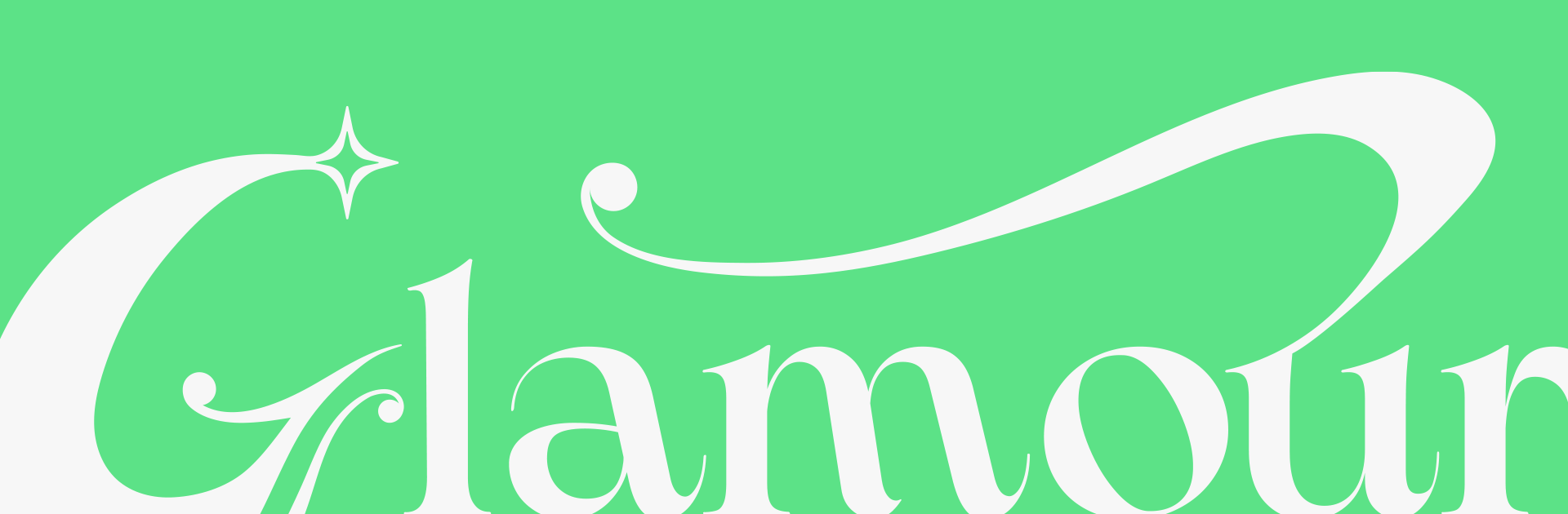
Glamour Claws sets a new standard in press-on nail artistry. In a crowded market dominated by generic online resellers, they came to us looking for a visual identity that would stand out both online and within their local community. I drew inspiration from the bold artistry of modern drag queens and the subtle sophistication of quiet luxury. The result is a timeless brand that lives at the intersection of elegance and effervescence.
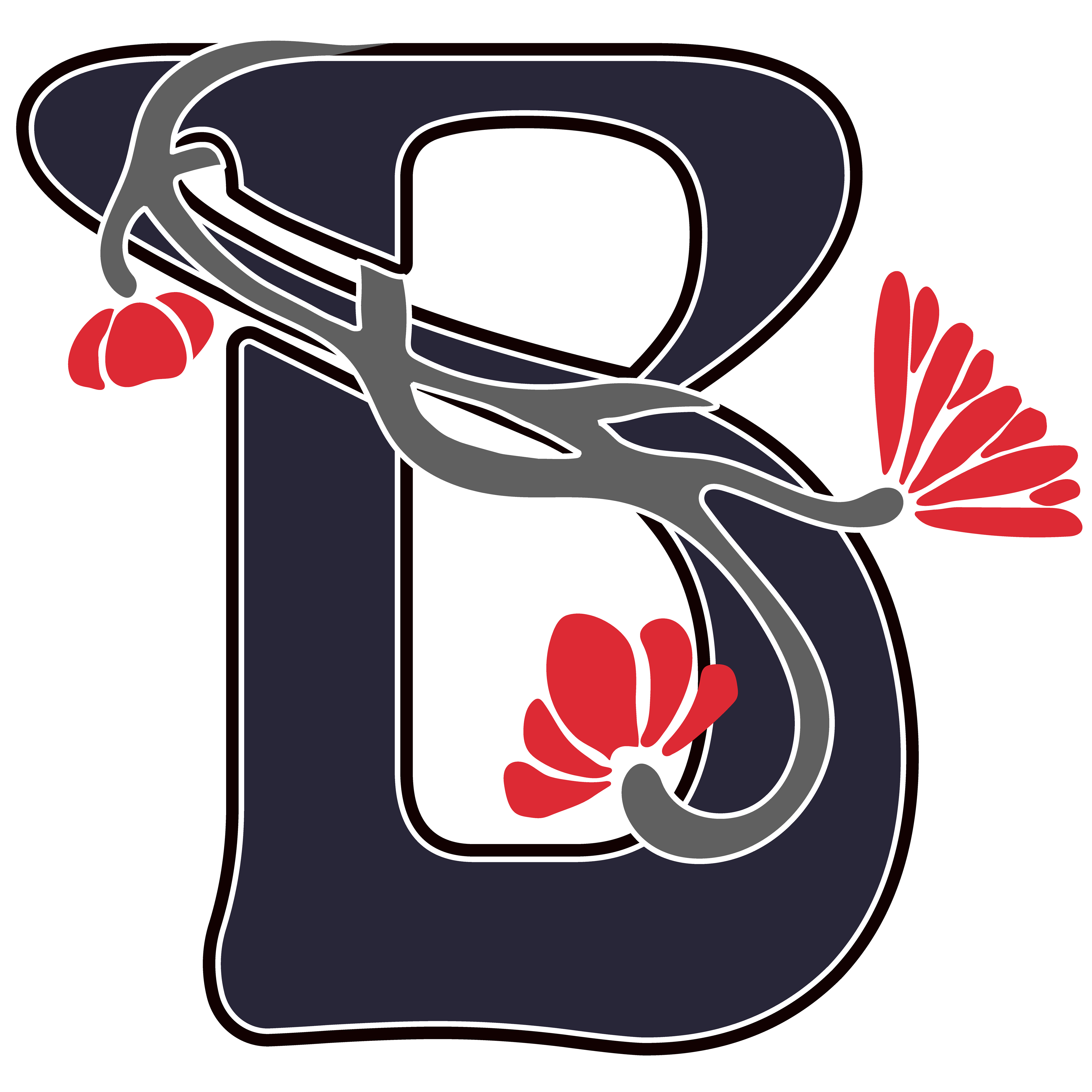
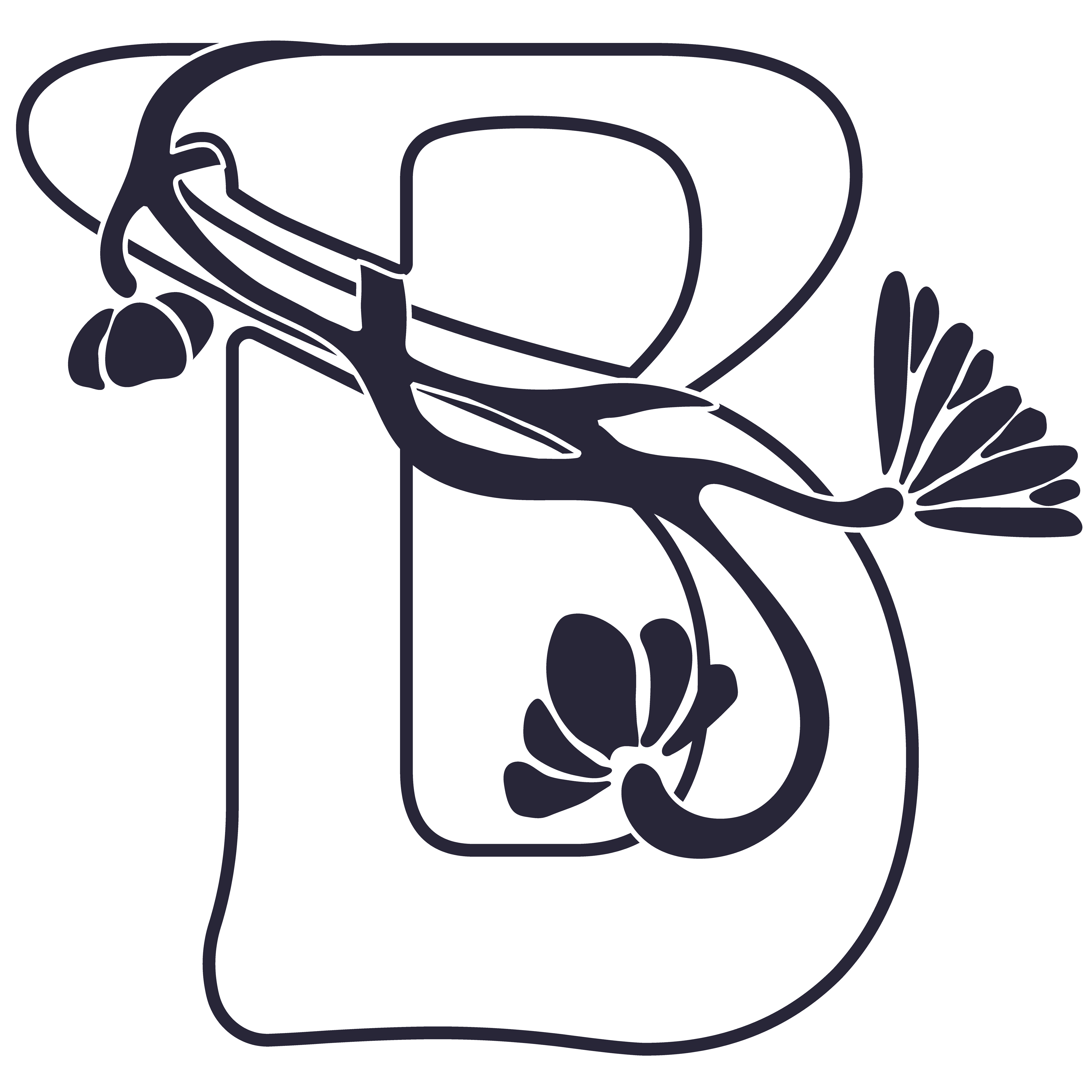
Initial Brand Marks
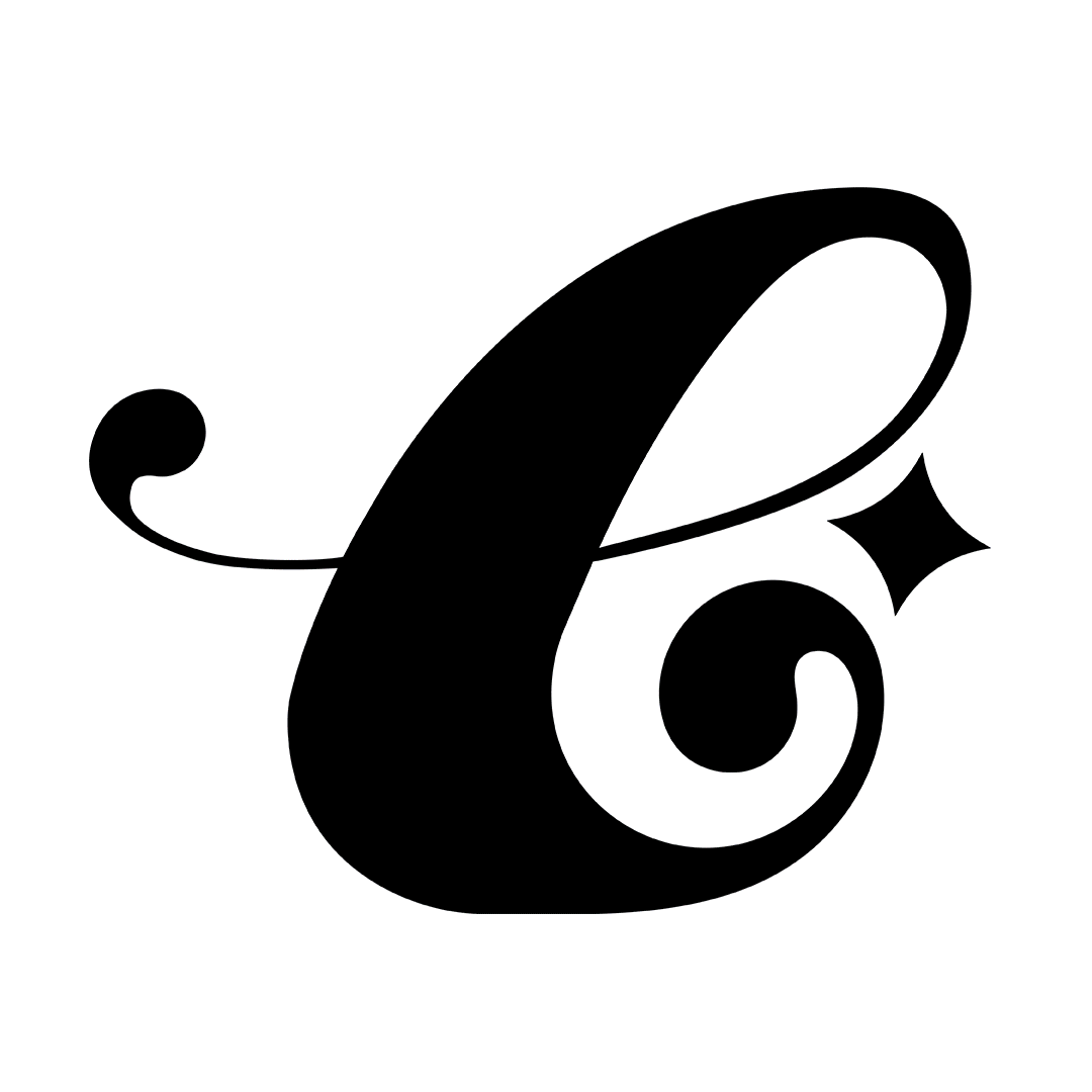
The first round of logos was intentionally varied. Using the classic–playful scale as a creative guide helped the client articulate their brand preferences.
The first round of logos was intentionally varied. Using the classic–playful scale as a creative guide helped the client articulate their brand preferences.
Brand Mark A/B
Building on the client’s feedback, I refined the selected directions with their full product range in mind. While they requested a softer, rounder version to reflect the playful side of the brand, I also presented a sharper, edgier variation—inspired by their their local market demographic.
This dual approach allowed us to explore how the identity could flex across their diverse offerings without losing cohesion.
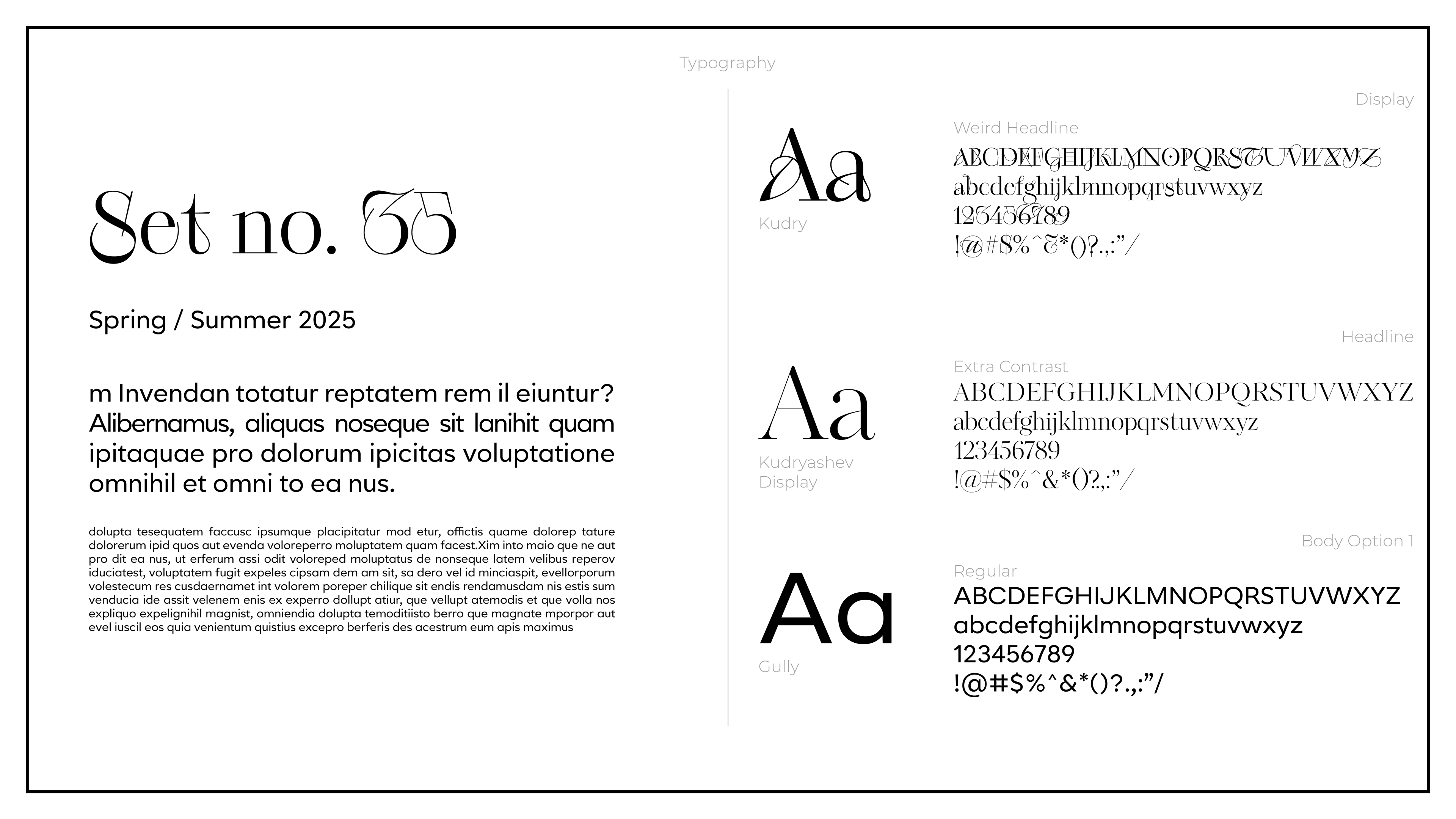

Typography
The Glamour Claws font was selected based on the characteristics of its logo--dynamic contrast, playful curves and elongated edges. The whole set was then paired to match that font's characteristics. I was especially focused on finding slopes off the cross strokes of "t's" across fonts.
The Glamour Claws font was selected based on the characteristics of its logo--dynamic contrast, playful curves and elongated edges. The whole set was then paired to match that font's characteristics. I was especially focused on finding slopes off the cross strokes of "t's" across fonts.
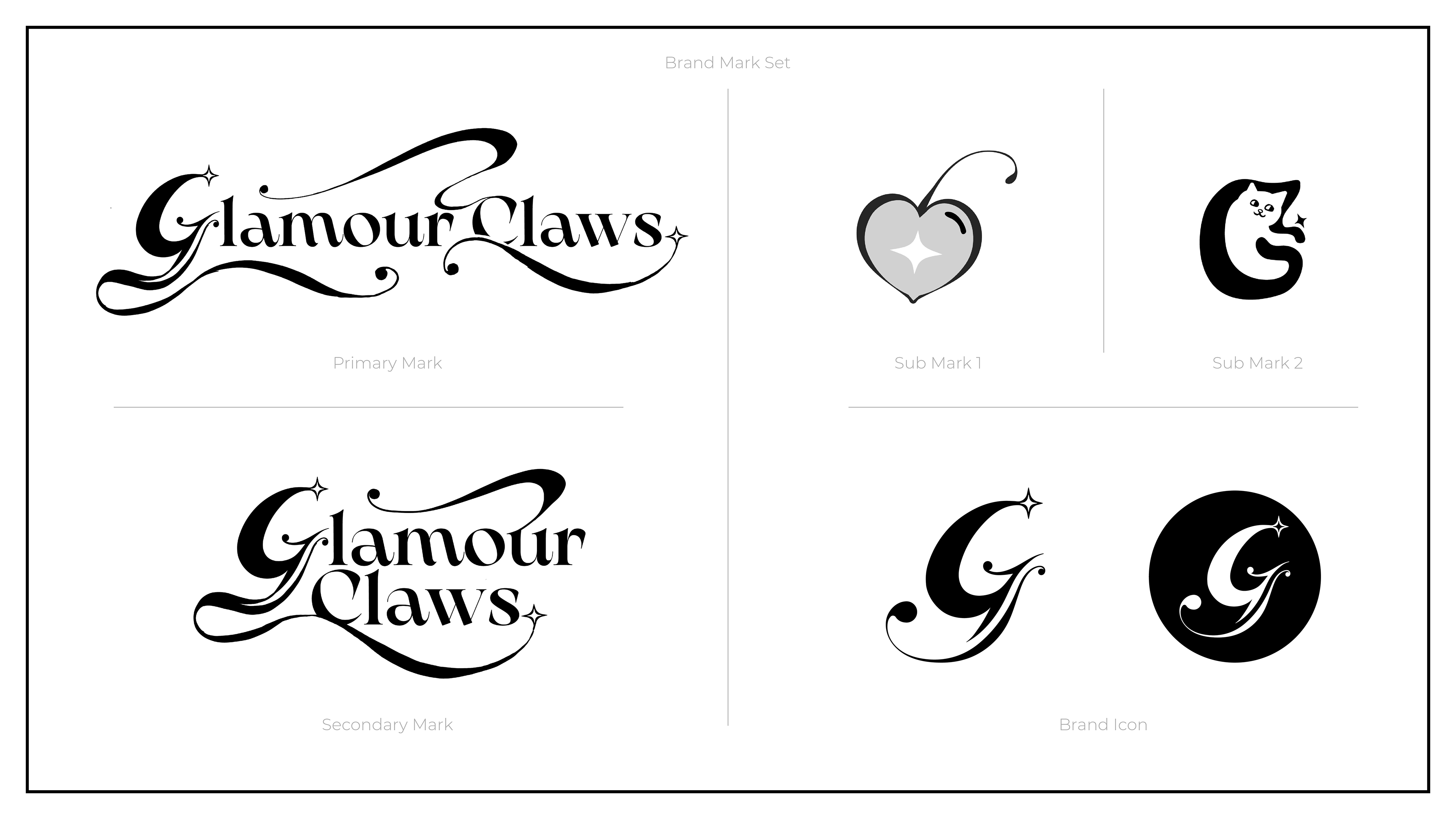
Final Brand Mark
To ensure versatility across print, social, and digital retail spaces, the brand mark was designed as a flexible system—broken down into multiple configurations that adapt seamlessly to various touchpoints.
To ensure versatility across print, social, and digital retail spaces, the brand mark was designed as a flexible system—broken down into multiple configurations that adapt seamlessly to various touchpoints.
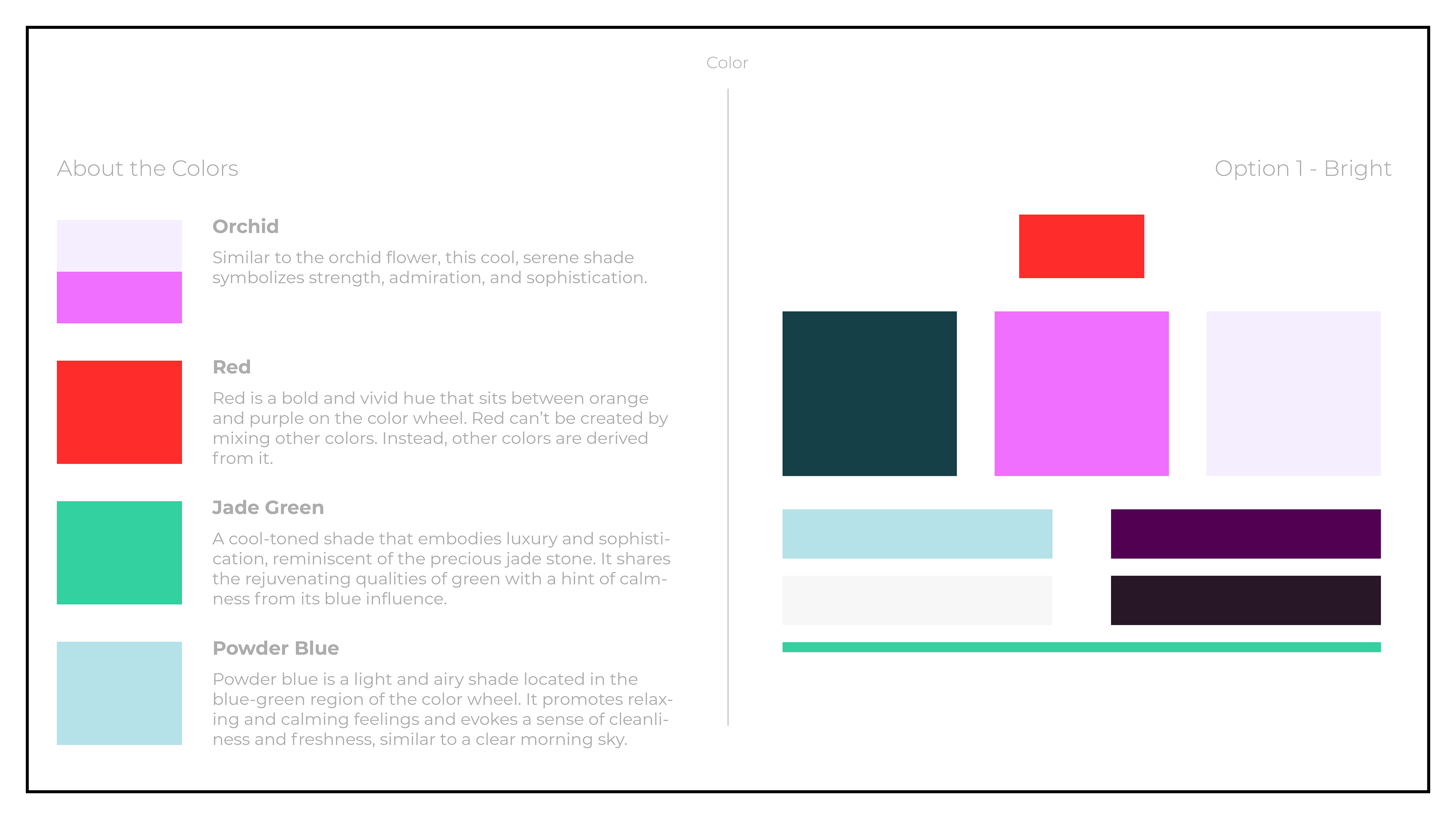
Descriptions adapted from "Color Meanings" via figma.com/colors/
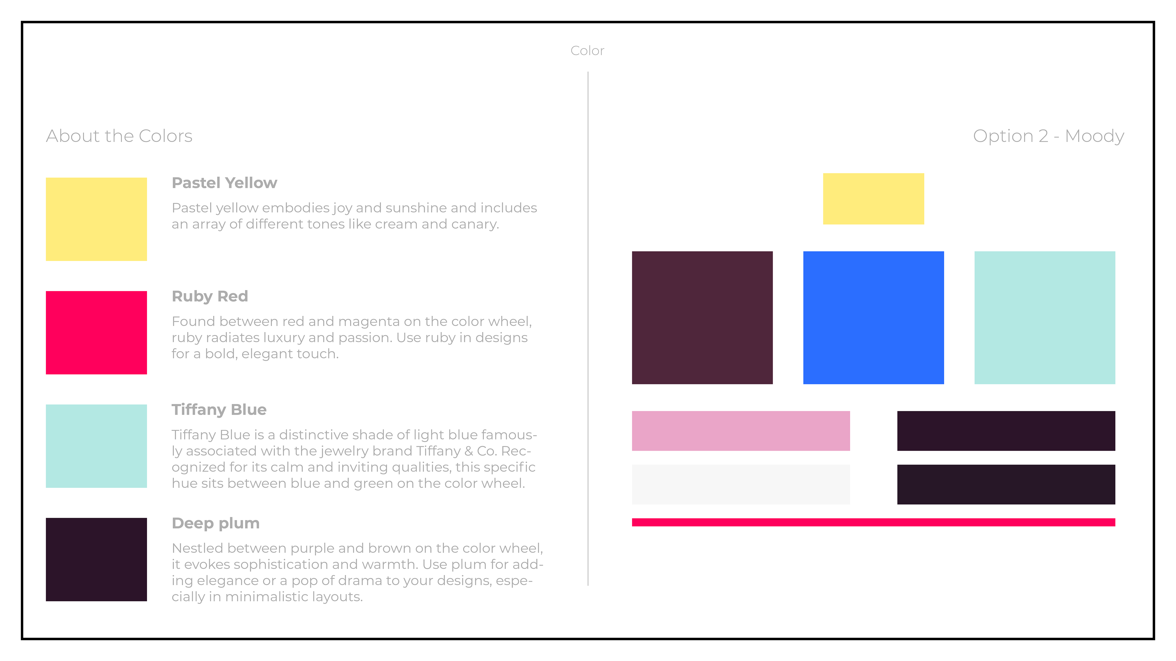
Descriptions adapted from "Color Meanings" via figma.com/colors/
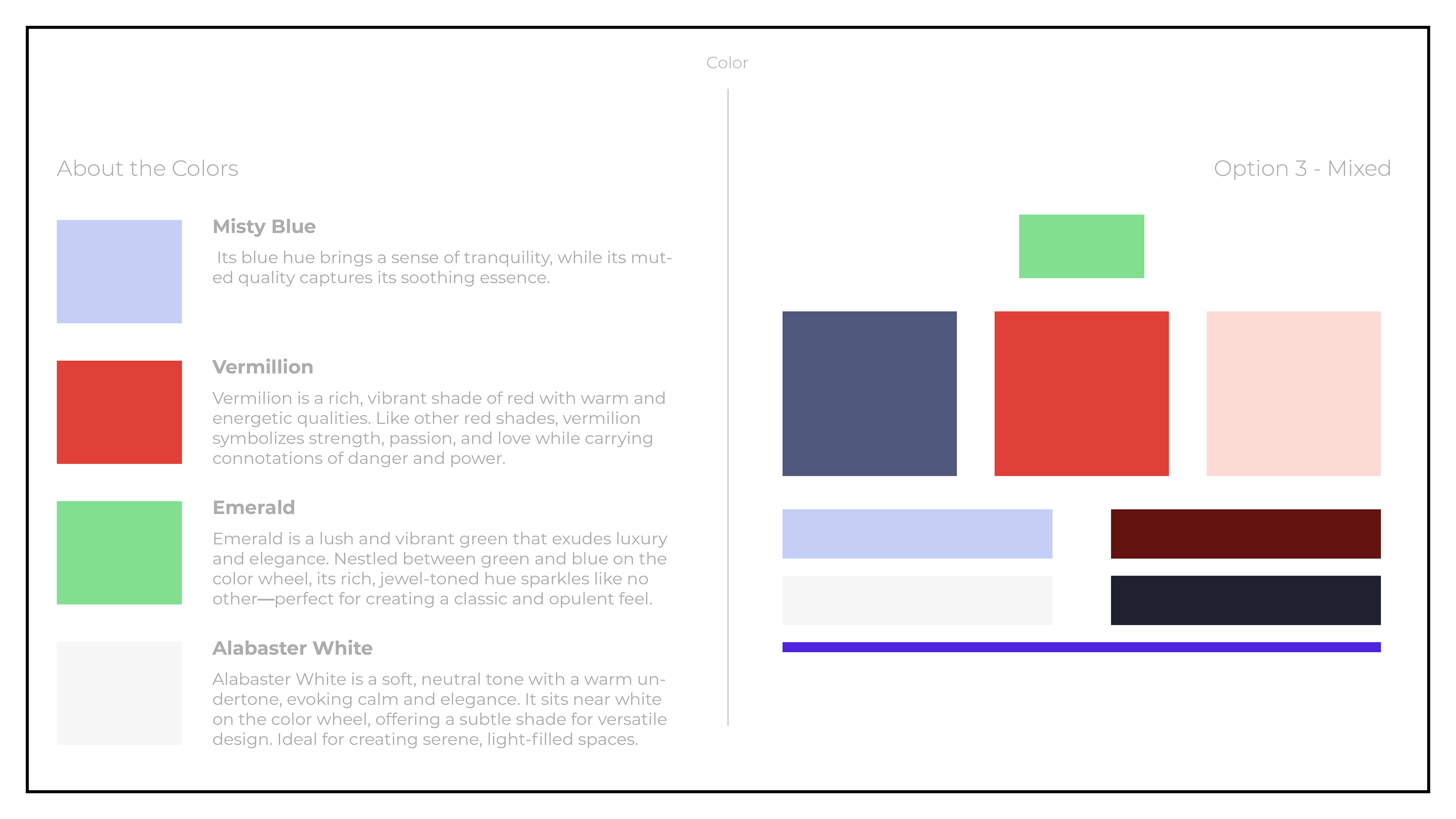
Descriptions adapted from "Color Meanings" via figma.com/colors/

Color Palette
To root the color palette in the product experience, I turned to real-world polish for inspiration—drawing from the household familiarity of OPI and referencing the iconic hues of Chanel’s Le Vernis line. The final palette blends trend-driven tones with timeless classics, echoing the brand’s dual spirit of elegance and edge.
To root the color palette in the product experience, I turned to real-world polish for inspiration—drawing from the household familiarity of OPI and referencing the iconic hues of Chanel’s Le Vernis line. The final palette blends trend-driven tones with timeless classics, echoing the brand’s dual spirit of elegance and edge.
With so much intricacy packed into each nail design, I aimed to create a brand environment that wouldn’t compete. Clean, spacious layouts and subtle accents ensure the product remains the visual focal point.
More to come!